Ecommerce businesses spend a lot of time, money and effort to design their landing pages and social media posts. Unfortunately, many of them do not give email design that much of a thought even though email marketing offers the greatest reach of all marketing channels as we presently have over 3.8 billion email users around the world.
Whereas it is important to have good email content, you will not accomplish much with your email marketing efforts if your subscribers find your emails sad to look at. And considering we live in a world where people’s attention-span keeps getting shorter by the day, your designs have to be nothing short of excellent.
As we all know, ecommerce businesses send out lots of email and having to design them each time will take hours hence the need for email marketing templates.
In today’s blog post, we will be sharing with you 5 design tips to help you come up with email marketing templates that save you time and converts better.
- Optimize for Mobile and Desktop Devices
- Use buttons over text hyperlinks
- Hyperlink all Images
- Build loyalty with brand elements Test Extensively
- Test Extensively

1. Optimize for Mobile and Desktop Devices
Ensuring your email marketing templates are optimized for both mobile and desktop devices is non-negotiable because 8 out of 10 people delete emails that are not optimized for mobile. That’s a pretty big deal.
Email optimization for devices goes beyond making your text readable, it also involves making sure clickable elements in the email are of the right target size. Because if they’re not, that means less people can click on them and that results in less traffic for you. Less traffic means less sales.
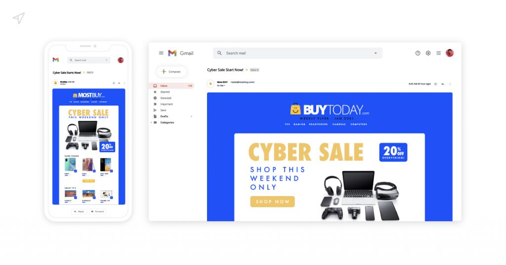
When you design your email marketing templates for desktops, you want to add multiple call-to-actions and use graphics like image banners. But when you design for mobile, you want to keep things simple. Put important links at top so your subscribers don’t have to scroll to find them. And use minimal graphics, it helps to reduce load-time.
2. Use buttons over text hyperlinks
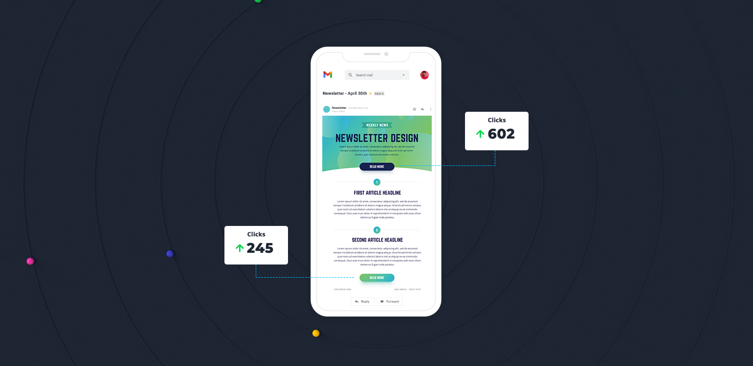
Most people scan through emails rather than read them so oftentimes they overlook the hyperlinks because they blend with other texts. Unlike hyperlinks, buttons stand out and are more noticeable especially when designed to have contrasting colour and interactivity. And because of that, they are also clicked more compared to hyperlinks.
When designing your email templates, you can draw even more attention to your call-to-action buttons using white spaces around them. This is especially good for mobile because it also creates a clear area for fingers to click. If you have multiple call-to-action buttons, make the primary one the brightest and biggest.
Also ensure your buttons follow a natural progression. You don’t want to make your subscribers backtrack to take action.
3. Hyperlink all Images
Whenever you use images in your email marketing template, make sure you hyperlink them. This is because images readily capture interest and prompt your subscribers to take more immediate action. So, if you have an image promoting a limited offer, your audience should be able to click it and link directly to the page where they can claim the offer.
Do not be tempted however to send image-heavy emails because they’ll be blocked by spam filters. We suggest you keep your text to image ratio at 80:20 to be on the safe side. Your email does no one no good if it never gets read. Also, make sure you give all your images alt text for users who may have their images turned off.
4. Build loyalty with brand elements
A quick way to build familiarity with your audience is to include identifiable brand elements in your emails. This will make it easier for them to spot your emails, and also make you memorable thereby improving the chances that your business will be the first option they’ll consider.
So, you need to create a brand identity guideline for your email marketing template specifying the colour palette, imagery, logo, font and tone of your brand. Be sure to be consistent in the use of this guideline across other channels like blog posts, social media, landing pages etc as much as possible. Consistency is vital in gaining customer loyalty.
5. Test Extensively
After you’re done designing your email marketing template you need to test it within different email service providers and across multiple devices.
There are 3 main thing you want to test for:
- Test the email sending capability – You want to know your email template is not marked as spam and can be relayed by SMTP servers. If there’s a problem with this, no one will get your emails.
- Test the email deliverability – Once you are sure your emails send out, you want to find out if they go into your subscriber’s inbox or spam folder by testing for deliverability. If they end up in the spam folder, then you should check your email marketing template to find out what triggers the spam filters.
- Test the email content – Here you want to preview your email on different devices. You want to ensure there are no broken designs or links. You also want to check the fonts, font size, colour palette to see that they display correctly. Basically, you want to have a feel of what your customer will experience.
This process seems very tedious and it actually is because remember, it’s your email marketing template we are talking about. Whatever mistake you make in your email template, you will carry it into every of your email campaigns so it’s best you do it right the first time.
Conclusion
Over time you might need to evaluate the effectiveness of your email marketing template. Behaviours and preferences of your audience might evolve and you’ll need to be flexible where need be, because in marketing the market(people) is the judge.
If you need help with your email marketing, click here to talk to an expert today.
Need to chat about your marketing automation strategy?
More than 10,000 marketers use Maropost to engage with their prospects and customers through emails, SMS, social media and more. We’re here to help you growing your business!
Chat Now